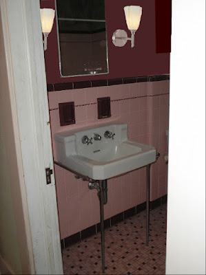
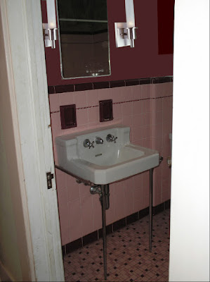
Anyway, we're not there yet, but...really...so close.***
I can't decide between 2 very different lights for the bathroom and, even thought the bathroom isn't painted, and the mahogany-walnut colored cabinet isn't in place yet, I was able to see into the future!
Well, you know, a very ragged, badly dropped-out, cut-and-paste sort of future:


***Note:Wall color? All wrong. It will be closer to color of dark tile. Size and position of lights? I used what used to be there as a guide. In other words, likely all wrong as well. Brownish-red blob on the right will be the new cabinet. Shut up-- I'm working with a dumbed down limited color palette.


7 comments:
Now I want to play with gimping (Gimp is the open source version of photoshop - www.gimp.org) my bathroom and kitchen to help pick out paint colors. Maybe I could gimp what my woodwork might have looked like before it was savagely cut out of my house! Inpsiration is a'brewing!
Back before we bought the house and I had somewhat different designs on the kitchen, I found a pic online of a kitchen with some similar elements and photoshopped a bunch of different colors...It was really fun and surprisingly helpful!
I like how the second set of lights reflect the linear features of your sink. In your photoshop mock-up the lines are quite striking. Somehow, everytime I open photoshop, I am there for days....really days. I just can't stop...
I would go with set #2... I really like their vertical lines! It really draws attention up, and in a small room that's a good thing!
I really like that second set of lights!
LOL! While I haven't used Photoshop for home renovations yet ( great idea,though!)I worked with Photshop extensively while employed at a portrait studio. After spending all day removing under eye circles, wrinkles and birthmarks I found it difficult to look in the mirror and not have the "toolbox" sitting in the top right of the reflection!
Damn! What just a little "smudge" an "erase" would do to make my day!!
I wish I could just 'clone stamp' over wall cracks and copy an internet bathroom and past it over my crapper of a crapper.
Maybe I'll play with my photoshop a little bit and see what I can come up with for my place.
Good idea!
Post a Comment